UX Scanning Patterns That Win Attention
First impressions are brutal. Master the UX scanning patterns shaping how users judge your page in 2026 – and win them in seconds. Users judge a site’s credibility in about 50 milliseconds.
That number changes everything. People no longer read pages in neat patterns.
Instead, they sift, jump and verify at speed. The old rulebook simply cannot keep up.
This piece unpacks the shift. It also shows designers how to respond.
Why the Old Scanning Rules No Longer Apply
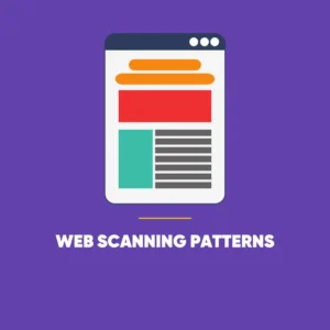
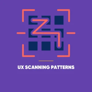 For two decades, the F-pattern and Z-pattern ruled. They mapped where eyes landed on a fixed screen.
Those maps are now relics. After all, agentic browsers and spatial computing have torn up the playbook.
Few users still travel top to bottom. They hunt for anchors of intent instead.
Many arrive with a goal their browser agent already knows. Their eyes sail straight past the hero section.
Instead, they leap to whatever answers their question. Ultimately, decoration loses and intent wins.
The lesson stings, yet it is simple. Designers must earn every single glance.
UX Scanning Patterns: The Three That Define 2026
Scanning now splits into three distinct habits. Each one rewards a different design move.
The Sifting Pattern
Consider the typical visit. A user meets an AI summary before the page even loads.
They skim it for a fact or a price. Then they open the page purely to fact-check.
This reshapes the role of every header. Each one works best as a bold, standalone claim.
A strong header summarises the section beneath it. Readers verify in a heartbeat, then move on.
Vague, clever titles now backfire badly, because modern UX scanning patterns push readers to skim, verify and move on fast. They stall the scan and cost the visit.
The Pinball Pattern
On interactive sites, attention ricochets. In fact, users bounce between calculators, sliders, 3D models and quick text.
The eye chases motion and usefulness, never a tidy line. So the liveliest element deserves the key message.
When a user drags a slider, their gaze locks there. That spot quietly becomes prime real estate.
Layered Spatial Scanning
AR glasses and headsets are now mainstream. People scan through depth, not across a flat plane.
They peer through translucent layers, fishing for relevance. As a result, elements that glow or refract under a gaze rise fast.
“Above the fold” suddenly means little. Focus and proximity now decide what truly matters.
Building Hierarchy Around UX Scanning Patterns
The tech has changed, yet clarity still rules. A handful of principles keep the modern eye on track.
Lead With Facts, Not Flourish
Witty headlines no longer pull their weight. Punchy, factual headers win trust far faster.
Every sentence must work hard. It either states a fact or nudges a decision.
Place Actions Where the Eye Rests
 Hierarchy refuses to sit still anymore. Adaptive interfaces reshuffle around intent and time on page.
When a user lingers on a pricing page, the call to action drifts closer. Meanwhile, idle menus quietly dissolve.
That keeps the path clean for the decisive click. Smart designers see that click coming.
Design Depth and Responsiveness
Looks alone no longer cut it. Master the UX scanning patterns that decide how users judge your page in 2026 – and win them fast. Instead, responsiveness has become the new measure of quality.
Refractive depth signals which elements sit nearest a user. Meanwhile, gaze-reactive highlights whisper that the page is paying attention.
Instead, they leap to whatever answers their question. Ultimately, decoration loses and intent wins.
What This Means for Designers
Here lies the heart of it. Interfaces have shifted from static maps to living conversations.
Users no longer scan to find buried information. They scan to test whether the page responds.
The winners lead with credibility and liquid responsiveness. Better still, they predict where the eye lands next.
They place the next step right in its path. All in all, the finest hierarchy in 2026 is the one users feel.